Šumava tourist destination
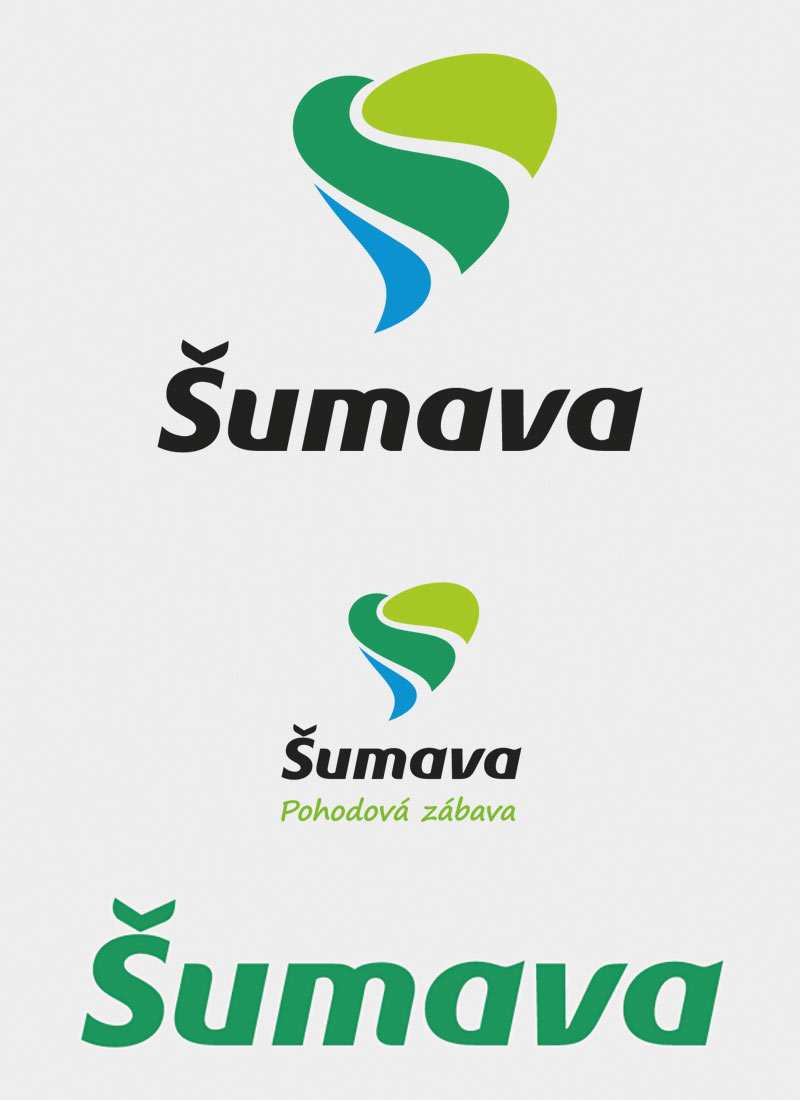
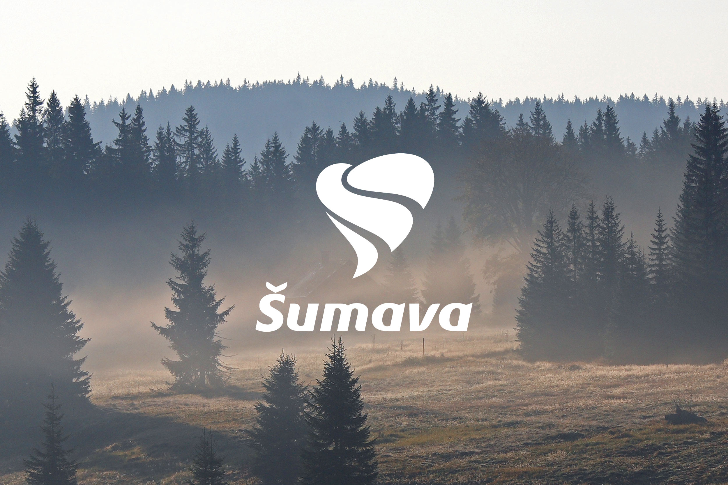
Although the heart motif can be a boring cliché, we used it and tried to work it according to the diverse requirements in the assignment. The resulting logo is dynamic, just like the development of the region. The heart motif expresses the positive attitude of local people and visitors to Šumava.
Concept
The individual parts of the heart symbol characterize the landscape elements according to which they are shaped. The light green color refers to meadows and sloughs. The dark green middle part represents the forests that cover the mountain tops and descend into winding valleys. The blue part is water in the form of mountain streams, rivers and lakes. The concept of the corporate identity divided the focus of the printed materials for the target groups using colors.
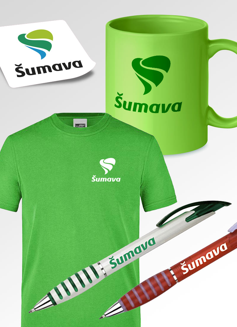
The graphic design also included a large collection of various brochures, maps, posters, banners, promotional items, pictograms, presentation stand etc.